FormDateTimeDelegate QML Type
FormDateTimeDelegate is a delegate for FormCard that lets the user enter either a date, a time or both. More...
| Import Statement: | import org.kde.kirigamiaddons.formcard |
| Inherits: |
Properties
- dateTimeDisplay : int
- initialValue : date
- maximumDate : date
- minimumDate : date
- popupParent : var
- readOnly : bool
- status : var
- statusMessage : string
- value : date
Detailed Description
This component allows to define a minimumDate and maximumDate to restrict the date that the user is allowed to enter.
You should not add a label but instead use the above FormHeader to specify what the form delegate refers to.
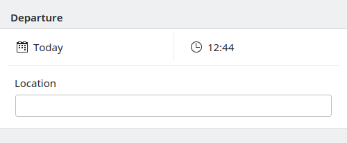
import org.kde.kirigamiaddons.formcard as FormCard

FormCard.FormCardPage {
    FormCard.FormHeader {
        title: "Departure"
    }

    FormCard.FormCard {
        FormCard.FormDateTimeDelegate {}

        FormCard.FormDelegateSeparator {}

        FormCard.FormTextFieldDelegate {
            label: "Location"
        }
    }
}
Note: This component can also be used in a read only mode to display a date.
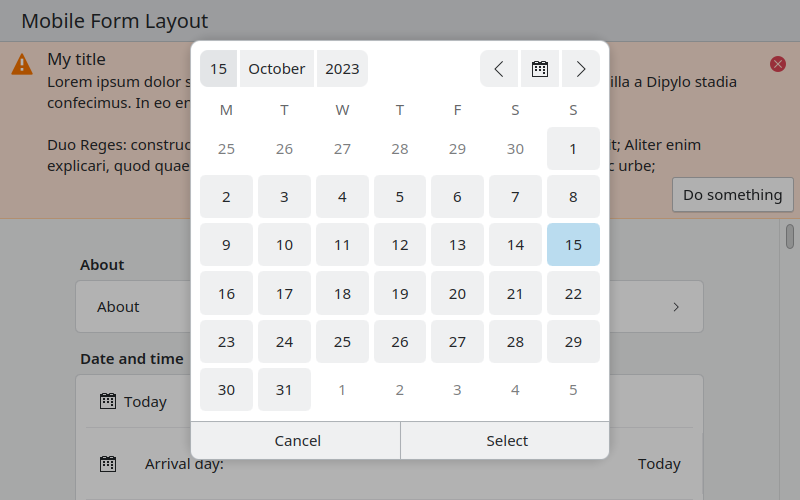
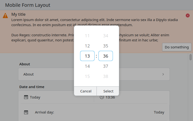
Warning: This will use the native date and time picker from the platform if available. For example this happens on Android.
Property Documentation
dateTimeDisplay : int |
This property holds which part of the date and time selector are show to the user.
By default both the time and the date are shown.
Accepted values:
| Constant | Description |
|---|---|
FormDateTimeDelegate.DateTimeDisplay.DateTime | Show the date and time. |
FormDateTimeDelegate.DateTimeDisplay.Date | Show only the date. |
FormDateTimeDelegate.DateTimeDisplay.Time | Show only the time. |
initialValue : date |
This property holds the the date to use as initial default when editing an an unset date.
By default, this is the current date/time.
maximumDate : date |
This property holds the maximum date (inclusive) that the user can select.
By default, no limit is applied to the date selection.
minimumDate : date |
This property holds the minimum date (inclusive) that the user can select.
By default, no limit is applied to the date selection.
popupParent : var |
This property holds the parent used for the popups of this control.
readOnly : bool |
This property holds whether this delegate is readOnly or whether the user can select a new time and date.
status : var |
This property holds the current status message type of the text field.
This consists of an inline message with a colorful background and an appropriate icon.
The status property will affect the color of statusMessage used.
Accepted values:
| Constant | Description |
|---|---|
Kirigami.MessageType.Information | (blue color) |
Kirigami.MessageType.Positive | (green color) |
Kirigami.MessageType.Warning | (orange color) |
Kirigami.MessageType.Error | (red color) |
Default: Kirigami.MessageType.Information if statusMessage is set, nothing otherwise.
See also Kirigami.MessageType.
statusMessage : string |
This property holds the current status message of the text field.
If this property is not set, no status will be shown.
value : date |
The current date and time selected by the user.