Icon QML Type
Class for rendering an icon supporting many different sources. More...
| Import Statement: | import org.kde.kirigami.primitives |
Properties
- active : bool
- animated : bool
- color : color
- fallback : string
- isMask : bool
- paintedHeight : real
- paintedWidth : real
- placeholder : string
- roundToIconSize : bool
- selected : bool
- source : var
- status : enumeration
- valid : bool
Detailed Description
source is the most important property, and determines where to get the icon from. It can be a FreeDesktop-compatible icon name, a URL, a local image file, or a bundled resource. Use fallback to specify the name of an icon from the current icon theme to display if the requested icon is not found.
Property Documentation
active : bool |
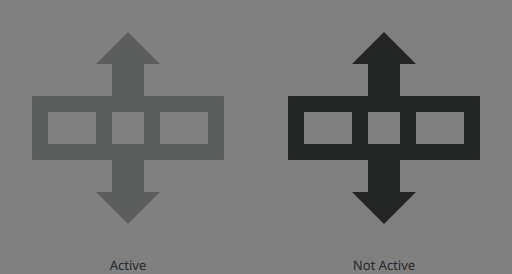
Whether this icon will use the QIcon::Active mode when drawing the icon, resulting in a graphical effect being applied to the icon to indicate that it is currently active.
This is typically used to indicate when an item is being hovered or pressed.

The color differences under the default KDE color palette, Breeze. Note that a dull highlight background is typically displayed behind active icons and it is recommended to add one if you are creating a custom component.
The default is false.
animated : bool |
If set, icon will blend when the source is changed.
color : color |
fallback : string |
The name of a fallback icon to load from the icon theme when the source cannot be found. The default fallback icon is "unknown".
import org.kde.kirigami as Kirigami

Kirigami.Icon {
    source: "this-icon-does-not-exist"
    fallback: "view-refresh"
}
Note: This will only be loaded if source is unavailable (e.g. it doesn't exist, or network issues have prevented loading).
isMask : bool |
Whether this icon will be treated as a mask. When an icon is being used as a mask, all non-transparent colors are replaced with the color provided in the Icon's color property.
The default is false.
See also color.
paintedHeight : real |
The height of the painted area measured in pixels. This will be smaller than or equal to the height of the area taken up by the Item itself. This can be 0.
paintedWidth : real |
The width of the painted area measured in pixels. This will be smaller than or equal to the width of the area taken up by the Item itself. This can be 0.
placeholder : string |
The name of an icon from the icon theme to show while the icon set in source is being loaded. This is primarily relevant for remote sources, or those using slow- loading image providers. The default temporary icon is "image-x-icon"
Note: This will only be loaded if the source is a type which can be so long-loading that a temporary image makes sense (e.g. a remote image, or from an ImageProvider of the type QQmlImageProviderBase::ImageResponse)
roundToIconSize : bool |
If set, icon will round the painted size to the nearest standard icon size.
The default is true.
selected : bool |
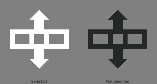
Whether this icon will use the QIcon::Selected mode when drawing the icon, resulting in a graphical effect being applied to the icon to indicate that it is currently selected.
This is typically used to indicate when a list item is currently selected.

The color differences under the default KDE color palette, Breeze. Note that a blue background is typically displayed behind selected elements.
The default is false.
source : var |
The source of this icon. An Icon can pull from:
- The icon theme:
import org.kde.kirigami as Kirigami

Kirigami.Icon {
    source: "view-refresh"
}
- The filesystem:
import org.kde.kirigami as Kirigami

Kirigami.Icon {
    source: "/home/example/cool.svg"
}
- Remote URIs:
import org.kde.kirigami as Kirigami

Kirigami.Icon {
    source: "https://example.com/kirigami.png"
}
- Custom providers:
import org.kde.kirigami as Kirigami

Kirigami.Icon {
    source: "image://provider/kirigami.svg"
}
- Your application's bundled resources:
import org.kde.kirigami as Kirigami

Kirigami.Icon {
    source: "qrc:/kirigami.svg"
}
Note: See https://doc.qt.io/qt-5/qtquickcontrols2-icons.html for how to bundle icon themes in your application to refer to them by name instead of by resource URL.
Note: Use fallback to provide a fallback icon from the current icon theme.
Note: Cuttlefish is a KDE application that lets you view all the icons that you can use for your application. It offers a number of useful features such as previews of their appearance across different installed themes, previews at different sizes, and more. You might find it a useful tool when deciding on which icons to use in your application.
status : enumeration |
Whether the icon is correctly loaded, is asynchronously loading, or there was an error. Note that image loading will not be initiated until the item is shown, so if the Icon is not visible, it can only have Null or Loading states.
| Constant | Description |
|---|---|
Icon.Null | No icon has been set |
Icon.Ready | The icon loaded correctly |
Icon.Loading | The icon is being loaded, but not ready yet |
Icon.Error | There was an error while loading the icon, for instance a non existent themed name, or an invalid url |
valid : bool |
Whether this icon's source is valid and it is being used.